
Every marketing strategy you run will have one single purpose at its core – to acquire a conversion. Conversions could be in the form of a form fill, a download, a purchase, or even just a click, and there is one element critical to encouraging these conversions, a CTA.
For someone who isn’t clear what a CTA is, a CTA, or a call-to-action, is an element that calls the viewer to take some action. The ‘Know More’, ‘Download for Free’, and other buttons/links you add to a campaign or webpage are CTAs. Its only job is to encourage the viewer to convert, and that’s why it’s incredibly important that you pay attention to the CTAs you roll out on ads, posters, the website, and so on. The CTA is quite literally the bridge between the marketing campaign (which can be an ad or a landing page) and a conversion.
A well-written and designed CTA can help you increase your campaigns’ and landing pages’ CTR and conversion rates. They are powerful, yet they aren’t too complicated to craft. There are excellent solutions in the market that let you create custom CTAs complete with a display banner and roll them out in a matter of minutes. Socxly is one such solution.
Socxly is a URL shortener that allows you to create CTA banners and link them with the shortened URL. It’s extremely easy to use, and you can generate CTAs in minutes. But first, let’s get the basics right and understand WHAT makes a good CTA, and then look into using Socxly to solve the HOW to create great CTAs quickly.
Here’s what this article will cover:
- Rules for Creating Great CTAs
- Creating CTAs that Convert with Socxly
- Why is it Better to Build CTAs with Socxly?
- Use Socxly for Free
Rules for Creating Great CTAs
1. Should be purpose-driven
The CTA should have a clear need and purpose. A CTA guides the viewer and tells them what to do next, and you know what happens when too many guides point in many different directions. Before you place a button or a link to a campaign, analyze if it needs to be there and if it is making a difference.

The ‘start your free trial’ button is a clear and crisp CTA, and although there is a ‘plan options’ CTA below it, it stands out and clearly draws the user in. The site knows what the user will find most interesting: a free trial, so they placed a CTA for it.
2. Location, location, location
Where you place the CTA is vital to engagement. Certain areas of a landing page get more attention than others:

This is called the ‘F-Shaped Pattern’. Viewers tend to sweep through content on a page in this manner, so placing important content, including CTAs, in these areas will increase the chances of engagement.
There are other strategies that you can use as well, like pop-ups and fixed CTAs:

Depending on what you’re trying to achieve, select a placement strategy and location for your CTAs.
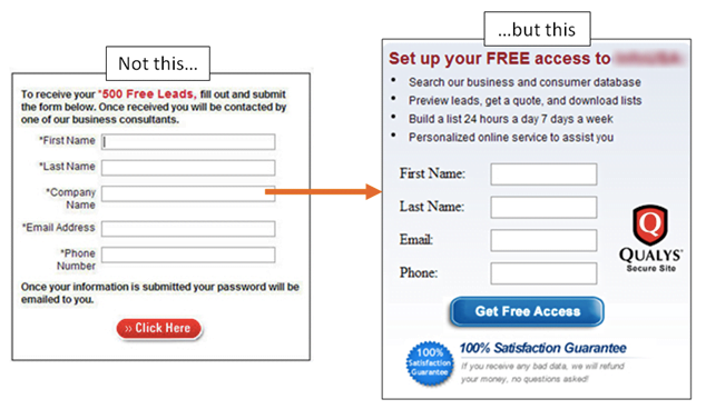
3. Design to be obvious
CTAs can have a simple design and be more content-focused or be designed to be flashy and grab attention. It completely depends on the style of the campaign or landing page and the message on the CTA. There’s only one rule when it comes to the design of a CTA— it should be obvious. The viewer should know in an instant there is a clickable CTA that will help them go forward in their journey. Check out these CTAs on Apple’s site:

Besides color, nothing separates the CTA from the rest of the text. This might not be a problem when it’s above the fold, but such CTAs placed below the fold could get lost as the user scrolls through. Now, look at these CTAs:

You immediately know what’s actionable and what’s not, and that’s the only rule to designing your CTAs – make them obvious.
4. The message should be clear
The message on your CTA should be clear, concise, and unambiguous. Don’t leave the reader wondering what it does; tell them clearly what the CTA is for. Take a look at this CTA:
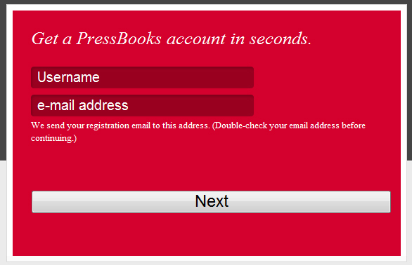
While the positioning and design of this CTA are great, the message could have been clearer. A simple ‘next’ leaves the reader with questions: Are there going to be more steps? How many steps are going to be there? Does this create the account, or does a payment have to be made?
They could have, instead, indicated what happens next – ‘create your free account’, ‘choose a payment method’, etc., would have helped elucidate what the next step is going to be, better. You can see how this would impact the CTR based on these examples:
5. Help them progress in their journey
Lastly, the CTA should take the user forward in their journey (whether it’s information or action), not keep them in the same place. Every CTA should help them progress towards the goal they are looking to achieve.
The CTA on an ad should lead the user to a landing page that gives them more information, and a CTA on a landing page should take them to the pricing page, which has a CTA leading to the checkout, and so on. CTAs should keep the user going forward.
Creating CTAs that Convert with Socxly
Now that you know the rules for crafting highly engaging CTAs, let’s talk about the easiest way of creating them. Normally, creating custom CTAs that you can embed in an email or a website would take time and effort. You must design the banner with the CTA and then code it into the email or landing page.
Creating banner CTAs doesn’t have to be challenging anymore, thanks to Socxly.
What is Socxly?
Socxly is a URL shortening service, but unlike most prominent URL shorteners in the market, Socxly offers many more features.
The free plan allows you to shorten 300 links every month which is more than enough for most businesses. You can easily include UTM parameters, pixel codes, and social media open graph content in a single short URL. You can track the performance of these links and gather metrics like impressions, clicks, and even conversions from the intuitive dashboard.
Apart from the URL shortening feature, Socxly also lets you create CTA banners which is the feature we’re looking for.
Creating CTA Banners with Socxly
Creating a CTA banner using Socxly is easy and takes just a few steps.
Step 1 – Creating the banner
- Log in to your Socxly account (you can do this even in the free account).
- Click on CTA Banner in the navigational panel and then click Create CTA Banner.
- Enter details like the title, the link the CTA should redirect to, and the UTM parameters to be associated with the CTA link.

- You can choose to design a banner within Socxly or upload a ready-to-use banner.
- Designing a banner within Socxly is straightforward; you add the banner message, CTA text, and an image for the banner. Socxly arranges these elements for maximum conversions.

- You can view a preview of the banner (shown on the bottom right) in real-time.
And that’s it, your banner is ready. The next step is associating it with a short URL.
Step 2 – Associating the banner with a URL
- Shorten a URL with Socxly

- Click on options -> CTA Banner and associate the URL banner created in the previous step with this short URL.

- Click on options -> CTA Banner and associate the URL banner created in the previous step with this short URL.
And that’s it. So how does this work?
How Does the CTA Banner Work?
You can share the short URL (https://socx.ly/suyati in this example) anywhere you like. When a user clicks on this short URL, they are taken to the associated long URL (which in this case is https://suyati.com/), and the connected banner automatically renders on the page:
 On clicking the CTA banner, the user is redirected to the URL connected to the banner (in this case, https://www.socxo.com/socxly/).
Why is it Better to Build CTAs with Socxly?
Well, the first reason is that it’s easy to design and build a CTA with Socxly. You can upload a banner if you’ve already designed one, or you can create one from scratch in just a few minutes.
The reason that makes Socxly’s CTA banners stand out from other methods, however, is the speed of use. You can easily link a URL banner to multiple short URLs and have multiple CTAs launched instantly. You can quickly swap CTA banners, add new ones, edit existing ones, and have the results published instantly. This makes the entire process convenient and extremely fast to execute.
And finally, Socxly tracks the short URL and the CTA banner and gives you useful insights like impressions, clicks, conversions, and so on. You can easily follow these campaigns from Socxly’s dashboard without making any configurations.
With these additional CTA banners on the website, you can increase website engagement and conversions.
Use Socxly for Free
Want to try Socxly for free? You get all the features we have to offer – URL shortener, CTA banner, organic campaigns, and so on, with the free plan. Give it a shot; we guarantee you’ll love it. Try Socxly for free.